Branding
Your Logo Is the Most Prominent Expression of Your Brand
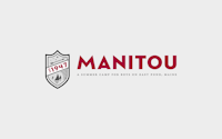
Manitou wanted to evolve their brand. Their old Indian head logo no longer fit the personality of the camp, and their wordmark needed refinement. We started by strengthening the letter forms of their wordmark, moving in a more masculine, modern direction. The tagline and shield are new. The tagline is about clarity — positioning the camp in the marketplace. The shield shows strength and stability, balanced with a sense of place, and the fun of adventure — everything a boys’ camp should be!
Keep Your Brand Consistent
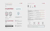
After finishing their logo we presented the camp with a brand sheet — a guide for logo usage, colors, and associated fonts, to help them keep their branding consistent across social media, merchandise, signage, etc.
We take our work seriously, and we go the extra mile, so you look like a million bucks now and in years to come.
We’re Here to Help
There’s a story behind every one of the logos on this page, just like there’s a story behind every camp. Is your story being told well? Give us a call to start the conversation.